BELGIAN WAFFLE RIDE
...
The Belgian Waffle Ride (BWR) is known to be one of the most unique cycling events in the world. It involves four events within the span of a year, lasting around 100 miles. They must endure dirt, gravel, steep bergs, long climbs, creek crossings, and head-winds. It began as a homage to the history of cycling in Belgium. The most important fact is that Belgian waffles are consumed prior to the race.
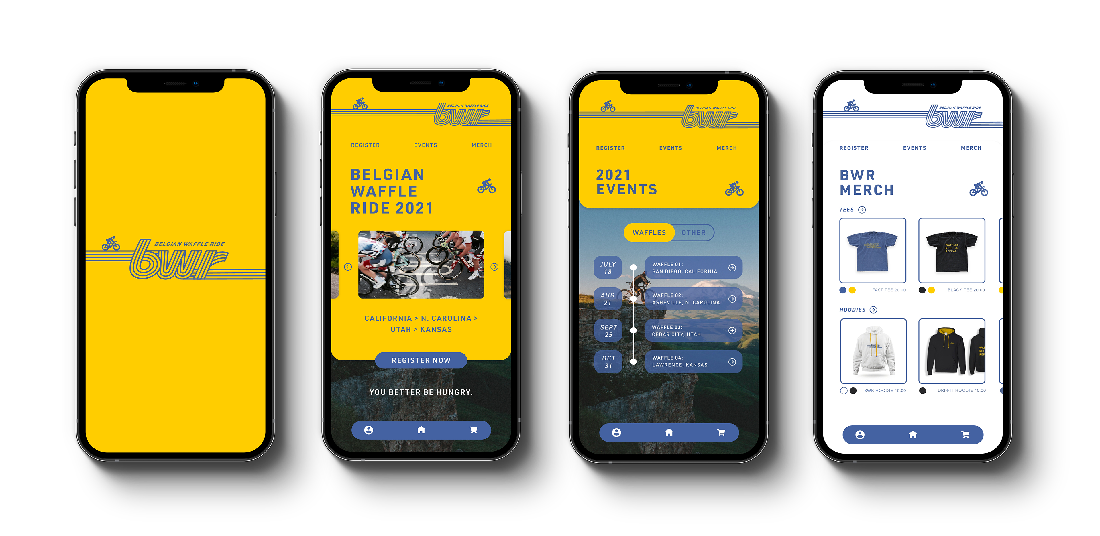
This project entails rebranding the entire brand identity of BWR. The goal is to create a modern, sleek logo with an exciting color palette that will expand awareness and attract a larger variety of cyclists.
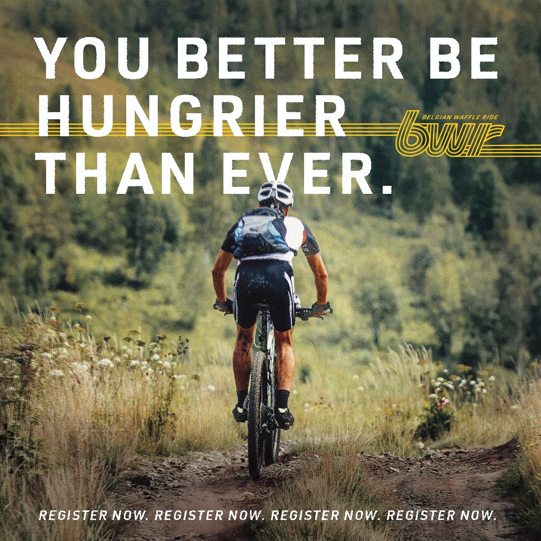
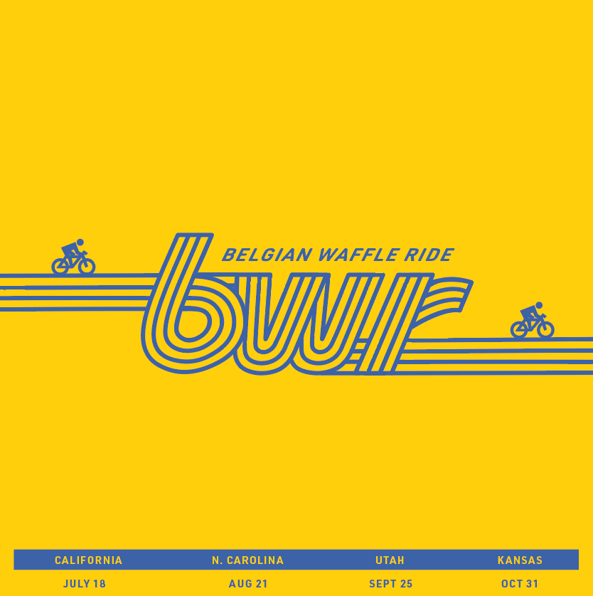
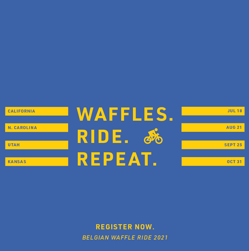
The final logo was hand-crafted to emulate speed lines and represent the 4 rides. The yellow was taken from the Belgium flag and the blue is an inviting color that creates excellent contrast against the yellow. The two-color color palette allows for cohesion across the brand. The biker icon is incorporated throughout the brand to reiterate it as a bike race to those that are not yet unaware of BWR. The all caps, rigid sans serif creates a sense of intensity for the brand.